


Washtenaw County Rain Garden Website
Overview
The Washtenaw County Rain Garden Program teaches residents how to design and install sustainable rain gardens that reduce stormwater runoff and support biodiversity. However, the website — the program’s primary outreach tool — struggled to engage and guide potential new gardeners.
My team redesigned the experience to provide structured learning, clearer navigation, and stronger community connection to lower barriers to participation and increase program reach.
.png)
TIME SPAN
August 2024 -
April 2025
TOOLS
ROLE
UX/UI Designer
UX Researcher
Figma
Photoshop
My Role
Led research, information architecture, and interface redesign of the Washtenaw Rain Garden website, including statistical analysis of usability metrics (task success, time, SEQ, SUS) to validate design improvements.
Key Design Features
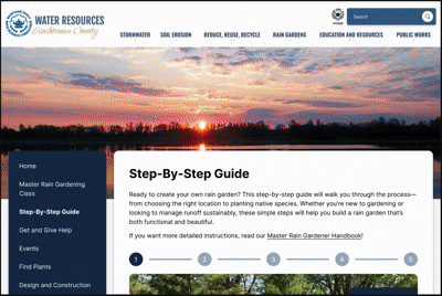
Step-by-Step Guide
Developed a simple five-step visual guide with FAQs, helping new users quickly understand the rain gardening process without feeling overwhelmed.
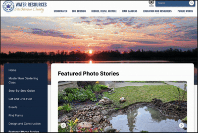
Featured Photo Stories
Reframed the photo gallery into storytelling-based profiles of real rain gardeners. This helped users relate to authentic experiences and feel less intimidated by the idealized image of perfect gardening.
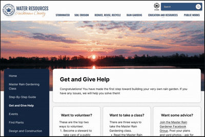
Get and Give Help Page
Combined mentorship, volunteering, and support into a single page with expandable sections. This reduced navigation and made both giving and receiving help more accessible.
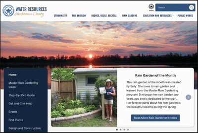
Homepage Reorganization
Created a “Community Highlight” section and restructured content to create a stronger sense of belonging and visibility among gardeners.
Process Overview

1. Problem
Potential rain gardeners were interested in sustainable landscaping but struggled with:
-
unclear navigation and information hierarchy
-
difficulty identifying how to start
-
limited visibility of community support
-
low confidence in ability to install a garden
These gaps reduced engagement and limited program reach.
2. Research
METHODS
-
Interviews with current rain gardeners
-
Survey + photo elicitation
-
Comparative usability testing (current vs redesign)
-
Heuristic evaluation
Participants included both experienced and potential gardeners.
KEY INSIGHTS
-
Structured learning supports onboarding
-
Environmental impact motivates participation
-
Time and labor discourage adoption
-
Visual + instructional content increases engagement
-
Community connection improves retention
Before-and-after photos and step guidance were especially valued.
PERSONAS
Two personas guided design: a beginner seeking guidance and an experienced gardener seeking community.
.png)
.png)
The beginner persona emphasized overwhelm and need for step guidance, while the expert persona highlighted desire for mentorship and community connection.
3. Design
DESIGNED REQUIREMENTS
Research translated into four core requirements:
-
Step-by-step beginner guide
-
Mentorship connection feature
-
Event calendar
-
Photo gallery with stories
These ensured structured learning and community visibility.
DESIGN PROCESS
INFORMATION ARCHITECTURE
An interaction map defined page relationships and actions to simplify navigation and user flow. The map clarified how users move between guide, events, help, and community content.

LOW-FIDELITY DESIGN
Low-fidelity sketches translated UX requirements into early layouts focused on guidance, community, and navigation clarity.
-
Homepage: Added Community Highlight carousel linking stories, advice, and volunteer content
-
Events: Introduced card layout with filters for easier browsing
-
Mentorship: Form-based mentor matching system for flexible pairing
-
Photo Stories: Story-driven slideshow with captions and narratives
-
Step-by-Step Guide: Simplified five-step process with embedded FAQs
%201.png)


KEY DESIGN DECISIONS
Step-by-Step Guide
A five-step visual guide with FAQs reduced overwhelm and clarified process for beginners.
Featured Photo Stories
Story-based gardener profiles replaced static gallery to increase relatability and motivation.
Get and Give Help Hub
Combined mentorship, volunteering, and support into one page to reduce navigation.
Homepage Community Highlight
Reorganized homepage to foreground community and belonging.
All decisions were driven by research and feedback iterations.
ITERATION
Design refinements addressed feedback from clients, peers, and users:
-
simplified navigation
-
renamed labels for clarity
-
expandable help content
-
reduced homepage text
Accessibility improvements included replacing hover interactions and adding a sticky menu.
4. Evaluation
COMPARATIVE USABILITY TESTING IMPROVEMENTS
Anxious frequent flyers who experience heightened stress during turbulence and long flights, especially when they lack real-time context.
Usability
-
SUS: 35 → 85
-
Task success: 77% → 98%
-
Task time: 58s → 17s
Perception
-
Navigation difficulty: 100% → 18%
-
Approachability: 13% → 82%
-
Sense of community: 13% → 100%
The step-by-step guide and community features drove the largest gains.
5. Outcome & Impact
The redesign significantly improved usability, clarity, and sense of community, helping rain gardening feel more achievable and supported for new participants. By reducing cognitive barriers and strengthening social connection, the website better supports adoption of sustainable rain-garden practices across Washtenaw County.
This project reinforced how strongly information structure and community context influence confidence in environmental action. Simplifying process complexity while maintaining credibility was key to making rain gardening approachable.